Framing Vintage Botanicals
We have a lot of clients that bring us vintage botanical illustrations and it has become one of my favorite things to design frames for.
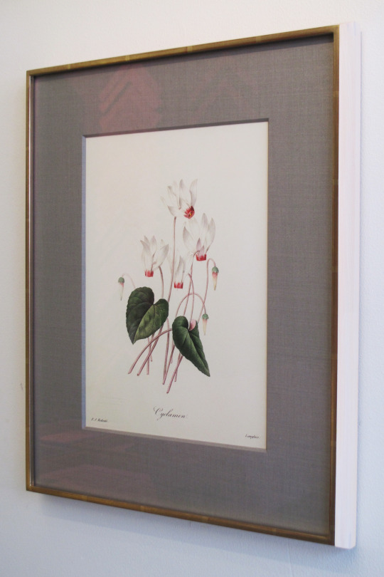
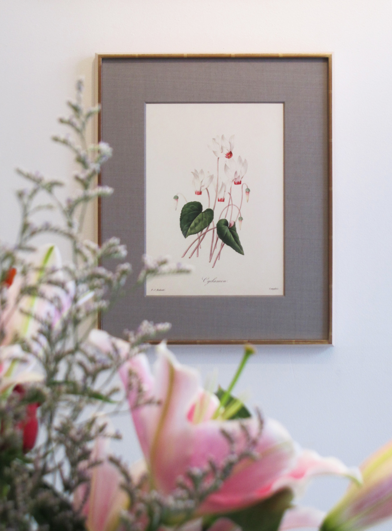
The soft colors in the illustrations pair beautifully with both metallic and wood finishes. For this piece we decided to do a mix of both. The pink tones in the flowers called for a moon gold but it was a little too strong so we toned it down with a natural maple with a white rub on the sides. Vintage art tends to look great with fabric mats and this mauve silk was the perfect color to separate the piece from the frame.
With a good eye for design, a piece of art can become one with the frame rather than the frame being something solely utilitarian. This piece is a great example of that.

